What’s Actually Working in Google AdSense Color Optimization
Light vs. Dark Theme Ad Containers
This one felt obvious until I stared at a site on my iPad in a waiting room for 20 minutes and realized none of the ads fit the dark theme. The most common mismatch is dark-mode blogs with bright, boxy AdSense units that look like they wandered in from a 2009 shopping API. You can’t just turn on auto-style and walk away.
What I’ve ended up doing is loading dark or light ad containers based on window.matchMedia('(prefers-color-scheme: dark)'), but here’s the fun part — if you’re caching the page or injecting ads from a service worker, that detection happens too late or gets ignored completely.
I now set a data-color-theme on <html> during server-side render and hydrate the correct ad container afterward. Is it a hack? Kinda. But uniformity matters. People click more when the ad doesn’t look like a glitchy billboard.
Real bug: On Firefox Android, cached pages with delayed client-side hydration don’t apply
matchMediaconsistently.
Text vs. Button Blue: More Subtle Than Expected
I used to assume all blues were created equal when it came to link colors in ads. Not true. There’s the classic #0000EE HTML link blue, then there’s the modern button-grade blues Google uses in its Material palette. Weirdly, I started getting better CTRs (click-throughs) when I personally dialed the link color to match my <a> color exactly—even if it was slightly washed out.
If you look closely at heatmaps (I used Microsoft Clarity and good old scroll maps), there’s a behavior pattern: people avoid clicking on elements that look out of sync with clickable UI in the rest of the layout. If your blog uses teal highlights and Google inserts bright blue links in ads, even desktop users gloss past them.
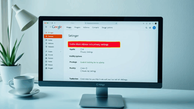
There’s a hidden setting inside AdSense > Ads > Style Panel that lets you override link color. Matching your main text links is significantly more useful than default blue in practically all cases, unless you’re deliberately going for contrast. But then you risk banner blindness creeping back in.
Mobile AdBox Padding — Just Set It Yourself
I fought with mobile ad margins on a Next.js blog with Tailwind for way too long before realizing the issue wasn’t Tailwind at all—it was that AdSense’s in-feed responsive unit stubbornly injected a 15px top padding… and sometimes bottom too. When space is tight and you’re relying on presence rather than volume, every pixel counts.
I compared rendering on a Pixel 4a, iPhone SE, and a Galaxy S10. On smaller screens AdSense seemed to throttle size dynamically, but the container padding was constant. So if you’re using a tightly scoped component layout, this shoves the ad off balance.
You can override some of it with:
.adsbygoogle {
  padding-top: 0 !important;
  padding-bottom: 0 !important;
}
…but this only works dependably if Google hasn’t decided to wrap the iframe in another div with inline styles (which happens if AMP is being sniffed from history). Honestly, render the unit once manually, inspect the structure in DevTools, and don’t trust the preview.
Things I Now Check On Every Page Type
- Viewport-size ad fit (especially wrapped blurbs near CTAs)
- Whether the ad container scrolls when it shouldn’t
- If padding is coming from Google or your own CSS cascade
- Breaking flexbox layouts surrounding responsive units
- Fast clicks near ads triggering accidental policy violations
Google Auto Ads Misfire in Sidebar Reflows
Let’s talk sidebars. If you let Google’s Auto Ads do its thing, it’ll often wedge an ad container inside your sidebar somewhere between widgets. This wouldn’t be so bad… if it didn’t ignore your breakpoints. On smaller breakpoints (i.e. tablet portrait), the sidebar compresses but the ad unit doesn’t, and visually you get a half-clipped Tetris block just sitting there.
Worse, the rendered block doesn’t collapse on failure to load. I once had an ad unit trying to fire in the sidebar above a “related posts” card, and ended up with 300px blank space because the iframe failed silently on first request (no JS error, just poof). I caught it when Lighthouse penalized me for Cumulative Layout Shift and wasted half an hour hunting a ghost div.
Fix is manual zone control. Stop trying to use auto insert. Instead, drop a well-sized <ins class="adsbygoogle"> manually into your sidebar partials, and use media queries to selectively switch off ads below a certain breakpoint. Or use a visibility trap like:
@media screen and (max-width: 768px) {
  .adsbygoogle { display: none !important; }
}
This buys you control. Especially useful when you’re running vertical tab-style sidebars on lower content density blogs.
Color Contrast That Actually Converts
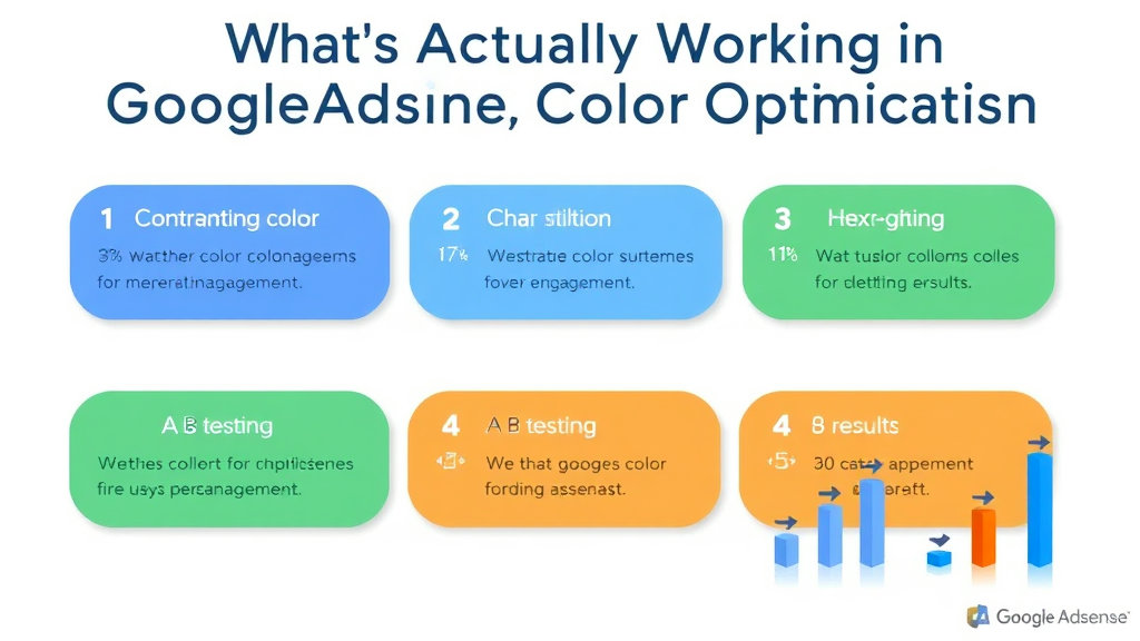
One of the best single-line wins: changing background color of in-article ad boxes to almost match callout boxes (like note, warning, info). It’s stupid how much better partial blend works than high contrast highlight. I changed from #ffffff to #f9f9f9 inside a section that had all callouts at #f8f8f8, and suddenly the layout didn’t feel interrupted.
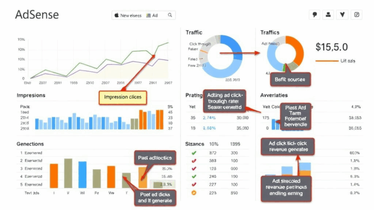
CTR went up far enough to be statistically clear in Search Console’s monetization tab after just a week. Felt silly not to have noticed earlier. People just really hate feeling interrupted when reading.
The quote that clued me in from an analytics email: “High engagement drop near top-median interrupt — possible layout resonance”
That’s analytics speak for “your box was too jarring, dude.”
Warning though: going too blended either triggers policy flags (making content and ads indistinguishable), or makes CPC plummet due to low intentional clicks. You’re aiming for soft visual transitions, not camouflage.
Sticky Footer Ads Have Trust Limits
I ran sticky footers across all pages for two months on a niche hardware walkthrough blog. Early results looked good — high visibility, frequent engagement — until I started getting Reddit DMs about ad blockers bypassing content by freezing stuck elements. I didn’t even think someone might tape over interactive content under stickies. If your layout uses accordion-like bottom menus, these ads hijack the tap zones.
More importantly than that though, users don’t trust clickables less than 50px tall stuck to bottoms of mobile screens. It feels like scam bait. One reader specifically said it felt “like those cookie bar dark pattern tricks.” Not great feedback.
Best use? Only enable sticky footer units on content pages that don’t rely on bottom-interactive elements and that end functionally. Like recipe blogs or static FAQs. Avoid them on progressive walkthroughs or tools with footers that link out.
“Aha” Moments When A/B Testing Background Fill
Here’s the thing I didn’t expect: slight saturation shifts in background color lead to wildly different perceived trust. I once ran two versions of the same ad unit in a test — one with standard white background, one with slightly yellowed #fffdef — and bounce rate improved by maybe 10% on mobile. I thought it was a fluke.
The trick is that readers experience warmer tones as content-friendly, while cold white feels corporate/spam-tinted especially when paired with overly sharp border radius. Zero documentation mentions this. It was a fluke I found while matching my comment block color fill and realizing CTRs ticked up in tandem after 3 days.
Not Obvious Until You Hit Render
- If your page background is off-white, pure-white ad units look fake
- Border radius over 12px = soft trust bump; under 4px = hard CTA
- Adding visible shadows kills coop metrics on mobile
- Hover states are meaningless on mobile, but helpful on tablet
- Don’t match headings — match quote block styles
I didn’t make these decisions because I read them somewhere — I stumbled into them while fixing contrast after a font swap and tracking CTR anomalies in Google AdSense’s experiments tab. Log your changes, even minor ones.
Responsive Ad Behavior on Page Load Is Not Consistent
This part drives me nuts. AdSense responsive ad units behave differently depending on whether they’re visible on initial paint. I can’t prove this definitively, but it’s appeared in three setups so far. One on classic WordPress, one on Nuxt.js, and one on a deeply cursed Ghost + Gatsby hybrid.
If the ad container enters viewport during fast load, the layout calc locks the ad at a smaller width than expected, leaving padding on the sides. But if you manually scroll into view after 600ms, the ad often fits edge-to-edge just fine (even with same CSS). Possibly related to how Google scripts fire in defer mode and finalize layout before clarifying aspect ratio. Either way, it means default units do not always cash in on full width, depending when and how quickly the rest of your DOM settles.
I had to force a reflow using this snippet to get around it:
setTimeout(() => {
  window.dispatchEvent(new Event('resize'));
}, 800);
That causes AdSense to re-check dimensions again after initial paint. No guarantee it’ll always help, but in my case it fixed a 40px whitespace edge issue in a card review layout.
