Using Heat Maps to Find SEO Sinkholes and Fix Them
What Heat Maps Actually Reveal That Analytics Misses
So you’re watching traffic climb in Search Console, but your bounce rate stays pinned to the ceiling like a wasp in July. I ran into this exact hell a few months ago — a blog post ranking #1 for a lucrative keyword, barely converting, and users vanishing like they smelled ozone. GA4 said people were panicking within six seconds. The heat map? Told the real story.
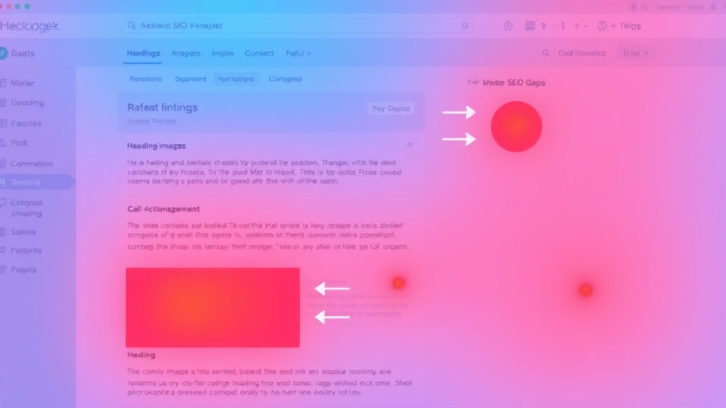
Traditional analytics tools log clicks and time, but they don’t show what nobody even sees. A heat map from Hotjar displayed a dark cold band below the fold — and that’s where the call-to-action sat, quietly suffocating. Users never scrolled. Not because the content was bad, but because I had an embedded social-share widget loading like an angry glacier right above the fold. Killed the scroll dead.
Point is: heat maps highlight inactivity just as much as engagement. That’s gold. Wherever you see a flat blue desert, that’s either a content dead zone or a render-blocking script dragging its feet. Either way, that’s not in GA4. It’s in thermography.
Choosing Heat Map Tools That Work With Dynamic Content
This took me longer than I want to admit. Not all heat map tools track SPAs (Single Page Applications) well — some freeze-frame based on initial DOM render and shrug at what happens after JavaScript takes over. That’s fine for your grandma’s WordPress landing page, but if your React/Vue components shift layout mid-scroll, you’ll want to look for tools with support for re-render events or virtual DOM snapshots.
- Hotjar: Works fine for vanilla pages — breaks if your site mounts components late client-side.
- Microsoft Clarity: Surprisingly solid SPA handling, but recording retention is short.
- FullStory: Most expensive, but handles dynamic reflows like a champ.
- Crazy Egg: Often outdated JS snippets — mind the cache invalidation.
I found out the hard way with a Nuxt.js blog where the comments loaded into a tab three seconds after page load. Hotjar never even noticed it existed. Only Clarity managed to trace user hover behavior over the write-comment button. So now, when someone says their heat map “proves no one finishes the article,” ask them: did your tool even wait for the page to finish loading?
Correlating Scroll Maps With Keyword Intent
This one feels like cheating once you see it click. Take an article optimized for “how to renew SSL on Nginx Ubuntu”, and then look where users scroll.
If they make it to paragraph three — the one with the certbot command — and drop off like it’s hot, what that really means is you delivered the answer and they don’t care about the rest. That’s not bounce; that’s success. But… if you padded that answer deep into paragraph ten just to keep time-on-page high? Scroll heat map won’t lie. Red at the top, ice at the bottom. That’s misaligned intent, and Google notices it more than you think.
“Buried answers kill snippets.” — I jotted that into a Notion doc after seeing two of my posts lose featured-snippet status the same week. Both had clear answer boxes… four scroll swipes down.
People scan. SEO robots scan. If your scroll maps don’t line up top-heavy with actual search intent highlights, you’re leaking position.
Heat Map Dead Zones Caused by Third-Party Junk
I once had a heat map that showed a perfect “white space” about 200 pixels tall between two paragraphs. At first, I thought it was a layout bug. Nope. It was an auto-inserted AdSense banner trying to load a 728×90 ad that never filled. It left a blank space, didn’t draw attention, and scared off the user with a jank scroll jump.
AdSense sometimes fails silently — the ad request renders a space, but if there’s no inventory to serve, it just sits blank. And if you’re not watching device-specific behavior, you’ll never realize mobile visitors are losing half their screen to a black question mark.
The undocumented part? On pages with display: swap fonts, combined with long CLS mitigation styles, I’ve seen ads fail to render five seconds after the page draws — they lose the timing window AdSense sets in their slot code. This was invisible in Chrome, but reproducible in Firefox Nightly.
Using Mouse Movement Maps to Test Title Tag Rewrites
Heat maps are not just thermometers — you can use them to test things very few people consider measurable. Like whether your title actually gets read. Rewrote a bunch of H1 tags to better match structured snippets — started tracking hover and pause activity just near the headline block. It’s dirty, but it works.
Quick version:
- Users hover + pause before scrolling = headline scored attention
- Users move fast and angle downward = scanning behavior
- You can see which keywords spark friction by watching jittering cursors
The unexpected part? Mouse movement correlates better to eye focus than you’d expect, especially on desktop. Not perfect, but good enough when you can’t afford full-blown eye-tracking gear.
I once changed the phrase “Generate Static Tokens” to “Copy API Access Keys” and watched cursor activity triple over the heading. Same paragraph content. Same anchor link. Heat map said it all.
Overlaying Heat with Segment Events to Trace Conversion Gaps
This only works if you have event tracking on individual elements, preferably via something like Segment or RudderStack. You want a visual overlay + tracked events per action point: CTA clicks, open-modal, form-submit, even meta events like “hover for more than 2s”. Once mapped, watch conversion drop-off vs. color density.
One bug I fell into: events fired multiple times when people double-clicked a button that looked unresponsive (custom debounce delay). So conversions doubled artificially in my data — but the heat map showed people jabbing the button like it owed them money. Look for overbaked JS friction layered under cold click zones — it’s usually a UX failure masked as user disinterest.
Also, if your promo box shows up in the first scroll view but records zero touches, and your Segment data backs up no interaction events, then it’s not a content problem. It’s either banner blindness or layout entropy. Fewer people than you realize are actually seeing your CTA — so stop A/B testing the button color and fix the content-to-action alignment first.
The Mobile Heat Map Mirage
If your heat map isn’t splitting mobile and desktop into distinct cases — and I mean totally discrete render paths, not just viewport width filters — you’re chasing ghosts. Had a client running a custom-built responsive site that looked neat on mobiles but used overflow: scroll wrappers with passive listeners. None of the iOS native scrolling actually triggered scroll depth events — so the content looked unread. It wasn’t unread. It was mis-tracked.
Undocumented edge case: iOS Safari versions 14–15 have partial support for scroll-bound listeners unless you explicitly opt-in to {passive: false} and do not debounce. I only figured this out by analyzing scroll maps that looked broken compared to the actual engagement from user sessions.
Fix was dumb simple: replaced the div-based scrollers with native flow containers. Boom, instant hot zones on content that was previously ice blue. I almost blamed the copywriter.
Scroll Traps That Fake Engagement in Heat Maps
I saw a SaaS landing page that looked like it had complete scroll completion — candy-apple red all the way to the footer. Turns out: scroll trap. Each scroll tick triggered a false scroll to next-panel behavior, so it was artificial engagement. Looked fantastic. Converted like a wet sponge.
If your dev built a layout with section snap-to-scroll or mouse-wheel hijacks, you cannot trust scroll depth stats. It’s technically a complete read, but psychologically exhausting. Real users bail, but the heat map still draws traffic flow in orange like it’s working.
Pro-tip: turn those interfaces off for a week and watch actual engagement collapses vs. fake scroll readout. If your bounce rate stays the same but heat zones crash, you were hallucinating warm users.
Quick Heat Map Tips That Saved Me from SEO Craters
- Track JavaScript errors alongside heat zones — broken carousels often kill scroll flow.
- Always set up different heat maps per template type (blog, pillar, comparison).
- Use position: sticky headers sparingly — they can falsely center clicks into the nav, not the content.
- When your first link is embedded too deep, users might never see it — watch the fold like it’s your new boss.
- Idle cursors can mean high reading — don’t assume absence of movement = bounce.
- If a button is high-density but the form isn’t, your flow is breaking post-click.
- Repeated user mouse loops often signal copy confusion. Especially near pricing.
Sometimes all you need is to make one line bold. Sometimes you need to throw the whole content module away.


