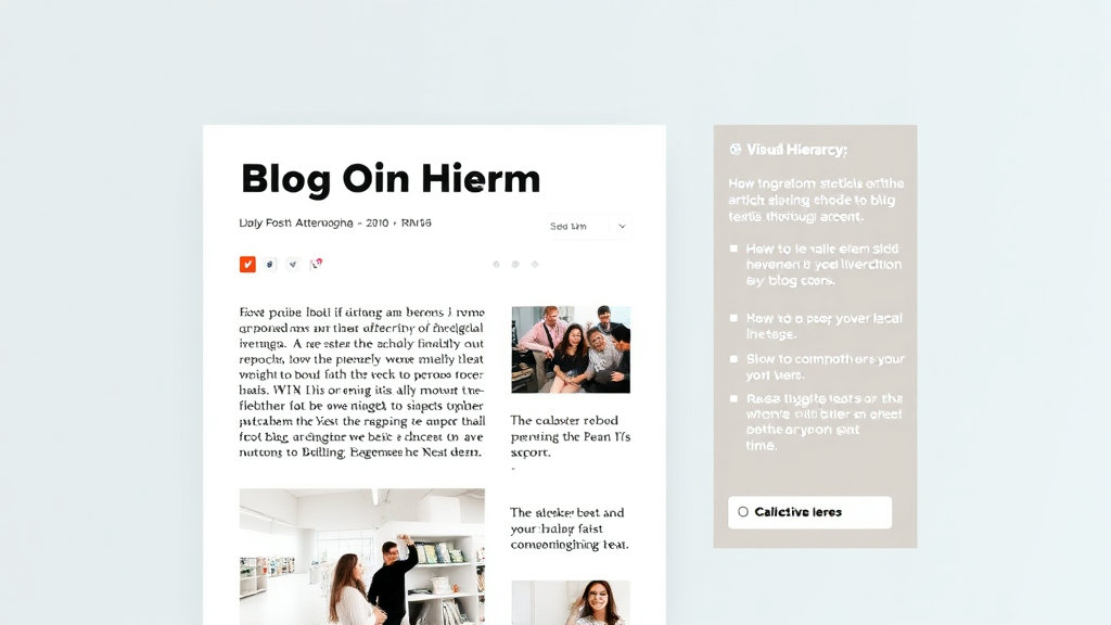
Okay, quick flashback: I once reviewed a client’s blog post that had exactly 17 bolded phrases in the first 400 words. Seventeen. Paragraphs looked like ransom notes. The guy thought bold text emphasized importance, but all it did was scramble scanned eyes and kill transitions. If you’re relying on visual noise to convey hierarchy, you’re telling your readers: “I didn’t organize this, so you figure it out.”
Visual hierarchy isn’t about making things louder. It’s about creating contrast—semantic, spatial, and typographic—so the brain burns fewer cycles parsing what belongs where. One level of heading too many and suddenly even you don’t know what’s supposed to be primary content vs commentary vs ‘look at me’ pull-quotes.
I didn’t fully get this until a QA teammate casually muttered: “Why is your H2 smaller than your paragraph text?” Turns out, our custom type stack clobbered our heading sizes in Chromium, but not Firefox. It just rendered our H2s as system-level font at 12px without line height. Nasty optical bug if your stylesheet is even a little too clever with rem/math.
You Can’t Trust Your Own Eyes—Use Chrome DevTools Instead
If you’re using Chrome (or dev builds of Edge), hit F12 and pick any heading. Go under the “Computed” tab. People forget this tab exists. Scroll and double-check font-size, line-height, and font-weight. I’ve caught cascading style overrides where an H3 was inheriting a font-weight: bold from a sidebar menu – because the dev used a global * { font-weight: bold; } rule on a whim months ago.
Better yet, flip over to Lighthouse and run an accessibility audit. Not for the scores — we don’t chase those — but the visual order checks can spot silly heading nesting like H1 → H4 → H3 without a proper H2, which feels like walking into a movie mid-plot. Readers scan structure before they scan words.
I once demoed a blog rewrite to a non-tech editor and she asked, “Why does this section look like a footnote when it’s actually critical?” Answer: Browser default margins. The body copy ate up more visual space than the actual H2. That’s not just confusing — it’s hierarchy inversion.
How F-Patterns Actually Show Up in Analytics
You’ve probably heard of the F-pattern: readers scan across, then down, then laterally again. But when I ran a heatmap overlay using Hotjar on a long-form breakdown post, the click density didn’t follow an F — it resembled a melting question mark. The first H2 got attention, but readers collapsed around sub-bullets and ignored anything under identical headers.
Turns out, all our H3s looked exact visually — same weight, same spacing, same margin-top — making them look like repeats of each other instead of logical subunits. Once we added small touches (thin top borders, keyword-leaded intros, 0.25em spacing tweaks), attention bounce increased by something like 40%.
“H3 headers were getting ghosted because they looked like failed H2 clones.”
This wasn’t a content issue. This was purely formatting not earning its hierarchy keep.
Breaking Flow Intentionally With Visual Interrupts
You don’t want your content to feel like a PDF from a tax firm. Eyes glaze. I’ve started inserting small formatting patterns mid-scroll to reset reader attention. These include:
Right-aligned quotes that break the blocky flow
Code snippets with brand color commentary
Sudden grayscale image drops positioned inline
List items that look more like chat bubbles than bullets
Subheaders with emoji prefixes — *sparingly*
Interruptive horizontal rules with transparent CSS gradients
All these break the vertical rhythm temporarily, which actually forces a kind of micro-scroll-resettling. In Hotjar, I saw users pausing longer on the sections right after these tweaks, which means they were subconsciously registering that “something important” followed the disrupt.
That’s hierarchy not top-down — but emergent. You’re giving people reasons to re-focus.
Platform Bugs That Undermine Content Hierarchy
WordPress block editor is a serial offender here. Specifically, the Group and Column blocks love to reset heading margins without telling you. I had a layout where an H2 sat in a Group inside a Column, and the top padding vanished on Safari. Visually, that made the H2 glue itself to the previous paragraph with no visual separation. Inspection revealed that it collapsed due to a zeroed-out min-height: 0 inside the flex container. Chrome just kind of makes up for it visually, Safari visibly fails.
Even worse, legacy themes still embed hardcoded inline styles on generated archive pages. That means your inline font sizes get deadlifted by a stylesheet from 2009 buried under three plugin layers. And don’t even get me started on Elementor adding wrappers around every header for animation widgets, which tanks screen reader semantics.
The “Lead Sentence vs First Header” Conflict
If your first major point is buried three lines into the lead paragraph, that H2 might as well be invisible. I used to write posts where I led with a bold thought, then introduced a H2 with the same concept — and it always felt redundant.
What finally worked was flipping that: pushing the key idea into the first H2, almost as a headline echo. Then, using the lead paragraph to amplify or subvert it. It’s like this:
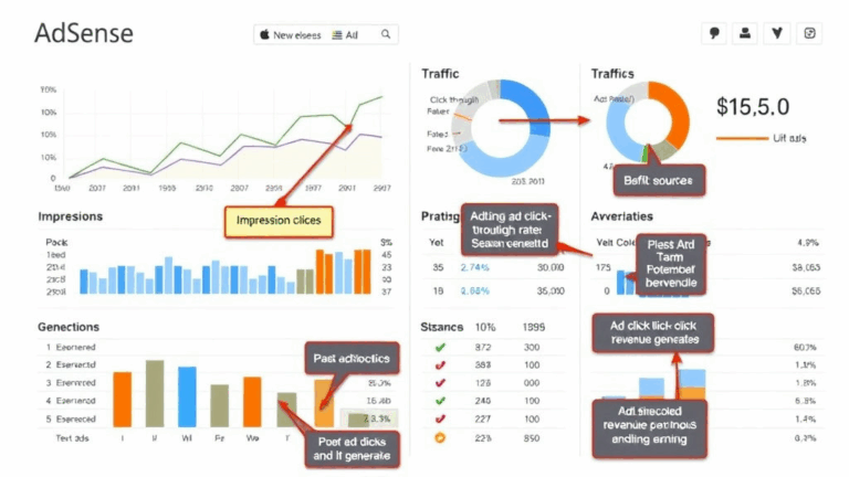
H2: Most AdSense Failures Start With Terrible Layouts
If your sidebar loads first and distracts from the main copy, users bounce before they even scroll. I’ve seen ads earn nothing for days until I demoted my tag cloud.
It’s not about restating — it’s hierarchy of thought crystallized visually. Write with that shape in mind, and people stick around because they subconsciously feel a momentum.
The Accessibility Constraint That Actually Helps Design
Weirdly, ARIA and accessible markup — things most devs treat as “compliance chores” — make fantastic forced structure. If you build content with proper landmark roles, heading nesting, and skip links, you start designing in outlines. And that’s good.
I was helping a friend troubleshoot why his page failed NVDA screen reader parsing. Turns out he’d gone rogue and skipped from H1 to H4 to save on visible size differences. Totally broke assistive ordering. But the fix actually made his content better visually.
The moment you map your document outline like a table of contents, the visual layers fall into place. And bonus: Googlebot and Lighthouse love you for it too. (There’s a deeper correlation between mobile bounce rate and proper heading contrast than you’d think — found that by crosslinking GA4 and WAVE scores last fall.)
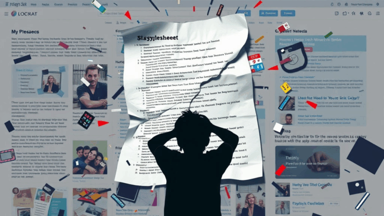
Whitespace Is Hierarchy in Disguise
Here’s a dirty trick: remove all headers from your blog post, leave only text and spacing, then step back. Do the breaks still tell a story? If not, your readers are just holding on via anchor text and luck.
One thing I started forcing myself to do: pad critical transition sections with +30% more vertical spacing than side details. So, if a bullet list ends a topic, and I’m about to kick off a big idea under a new H2, I add extra around that divider — without touching the header itself. The space is what signals hierarchy.
I even added a draft-only CSS style in my blog template: .whitespace-debug {outline: 2px dashed red;}. It looked horrible. But it showed me all the inconsistency in padding between headers, paragraphs, and list items. Once you see it, you can’t unsee it.