Creating Blog CTA Buttons That People Actually Click
Why Most Blog CTA Buttons Just Don’t Work
There was a point last year where one of my sites had this beautifully animated neon blue button. Sleek hover effect, subtle drop shadow—it looked amazing. Still, nobody clicked it. Not one click for three weeks. Turns out, it blended so perfectly with the overly designed header that it fried into the background and looked like static decoration.
The mistake? Assuming visual polish equals action. It doesn’t. CTA buttons that work are clear, brutishly simple, and weirdly under-designed compared to the rest of the UI. “Read More” is useless. “Download Your Copy” gets clicks. People default to recognizable language and positioning habits when they scan pages. If you break those assumptions, you’re toast.
Positioning: F-patterns, Gut Scans, and Useless Heat Maps
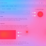
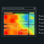
I stopped using Hotjar for button placement testing a while back because it gave me false confidence. One blog had a wide red CTA halfway down the article—looked like people hovered all over it, but my GA events showed click-through rates were dead low. Turns out scrolling pauses during skims were registering as engagement.
The real-world scan pattern is somewhere between the traditional F-shape and a vertical skim. Most users visually scrub the left margin top-to-bottom and only detour to the right if you hard-stop them. That’s where strategic indentation or layout interruption helps. A right-aligned CTA far down the sidebar? Basically ad blindness. A centered CTA five paragraphs in = gold.
There’s also the classic dead zone around image captions and footnotes—don’t bury buttons near either. People interpret those blocks as unimpressive filler.
When Buttons Look Like Ads (And Get Ignored Like Ads)
You know what triggers split-second blindness faster than anything? Banner-style CTA buttons that match your display ad styling. I ran AB tests on a dev blog where a flat orange CTA with sarcastic microcopy got clicked far more than my fancier green pill-shaped button that resembled native ad styling.
The problem: visual confusion with programmatic ad units. If someone instinctively glances over your CTA because their brain tags it as a probable ad, forget getting that click. That means you need to either:
- Visually distance buttons from anything that could be ad-detected
- Use dense-text labels rather than short verbs (“Get the blueprint” vs “Learn more”)
- Give buttons whitespace like they belong to the content, not the layout extras
- Watch for color overlap with AdSense theme matches if you’re running auto ads
It may feel wrong to make buttons ugly—but sometimes you need them to scream “This is content, not a target CPM unit.”
Text Inside the Button: Power Words Aren’t Enough
I’ve seen the advice. “Use action-driven verbs!” Yeah, no kidding. That said, words only work when they speak to the reader’s suspicion—or excitement. A lot of CTA copy dies because it tries too hard to sound confident or clever (“Unleash Your Potential”) without giving a reason to bother.
What did work unexpectedly well on a tutorial I wrote about nginx reverse proxies? One afternoon I swapped out “Get Tips” with:
Fix Your Reverse Proxy (Before Chrome Yells at You)
It was less polished, more human, and deeply specific. Clicks quadrupled. This accidentally touched something I now use often—CTAs that echo real user panic.
Undocumented Content Behavior
If you’re using AMP or theme frameworks that modify HTML classes for styling, be careful with what lives within the button tag. I once had a “Download Now →” CTA where the right-arrow symbol was injected using CSS :after. Guess what? It disappeared completely on feed aggregators that sanitized non-standard pseudo-elements, and people literally told me the button looked broken.
The fix was to hard-code the arrow in the HTML. Always inspect your rendered output in multiple contexts—including email digests if you have RSS subscribers (they often strip classes aggressively).
Mobile Tap Zones and the Rage Tap Trap
This one burned me right before a product drop. The CTA looked right on mobile. It loaded fast. It seemed center-aligned. And every click? Misfires or rage taps. I hadn’t tested the safe touch target area—and on smaller screens, anchoring the button inside a 50%-width div meant palm pressure floated users just outside the invisible perimeter.
The basic rule: your buttons need at least 44px tap height on all devices (per Apple’s old HIG rules). And honestly, go bigger. Also separate them from footers, tag clouds, or dropdown toggles—thumb drift is real, and it kills intent. If you can’t quickly pop the clickable area in DevTools with the inspect tool and see good hitbox space, it’s probably too small.
Contextual Inserts: Mid-Post vs Footer Graveyards
Nothing is more haunted than the footer CTA. People know it’s coming. They know the pitch. And unless you catch them while they still care about what they read, you’ll lose the click to a back swipe.
Mid-taking-notes CTA performance is where it’s at. I discovered this when blogging about Cloudflare DNS setup hell—I dropped a miniature button right after I mentioned CNAME conflicts. The anchor text said, simply: “Check your DNS sanity.” Sent it to a sanity checklist I wrote. Massive click rate. It hit during actual confusion. That’s your only winning window.
Also: never ever smooth-scroll people to your CTA. It looks like a hijack. Anchor linking is fine. But don’t animate the scroll unless your audience is 100% in the accessibility-and-animations-are-fun camp (spoiler: they’re not).
When Analytics Lie About Button Success
If you’re tracking CTA button clicks via JavaScript events, triple-check whether your buttons are inside single-page-app containers or wrapped in <a> elements with event-propagation-stopping wrappers. I had one setup running over React where the button reported clicks… grabbed by a parent component that blocked default behavior, so users never actually landed on the resource. Bounce rates looked great. Nothing converted.
The fix? Plain old debugging in Chrome DevTools. Open the Sources tab, add a breakpoint on click events, and test if the navigation actually fires. Also, always test in Incognito with extensions off—I once had a Firefox user report a blank redirect page and it turned out Ghostery was blocking the entire button’s hyperlink because of a sketchy outgoing domain in the parameters.
The Button That Worked Too Well (And Fried My Server)
This is less technical, but kind of hilarious. I had a blog post explaining how to optimize Docker images for Node.js. At the bottom, I added a CTA: “Try My Base Node Image (Alpine + Build Tools).” Button linked to a direct DockerHub image. I didn’t rate limit it. Overnight, I hit whatever internal throttle Docker uses for anonymous pulls. My blog started 503ing when the embedded badge couldn’t load.
Lesson: when your button works too well, it can backfire if the endpoint can’t scale. For any download button, consider load-testing the destination. Also: cache SVG badges locally if they live on third-party infra. That DockerHub badge ate my TTFB alive for a week until I noticed.
Unsolicited Practical Button Wisdom (From Screwing This Up Repeatedly)
- Never place CTAs within collapsible accordions. Most readers don’t expand them.
- Avoid using
display: flexor grid on buttons with nested links—it breaks in Gmail. - Use
aria-labelgenerously. Screen readers screw up SVG-only buttons constantly. - Don’t animate CTAs unless they serve a stateful purpose (e.g., loading)
- Color contrast wins more clicks than vibrancy. Always test against WCAG AA or better readability.
- If your button disappears after form submission, expect people to click it again by reflex (debounce that handler!)
- Remove
target=_blankin CTAs that lead to other site content—it signals “this isn’t a continuation”
Sometimes your best-performing CTA isn’t the biggest or brightest. It’s just the one that makes sense when someone needs to click it the most.

