Client-Ready SEO Reports Without Getting Lost in the Noise
Don’t Start With Search Volumes — Start With Client Sanity
Every SEO report that starts with keyword stuffing and volume stats? White noise.
Clients glaze over. Most agencies still open with “1,400 searches per month” like it means something out of context. If you’ve ever had a local lawyer client interrupt you mid-slide with, “But why do I care about that?”, you know what I mean.
I learned to anchor around outcomes, not charts. Instead of ranking positions, show the net effect: increase in click-to-call conversions, highlighted changes to organic CTR, actual lead counts from GSC-verified URLs. One time, I stitched data from Google Search Console and a call tracking system just to prove that a drop in impressions wasn’t hurting leads — we were getting fewer tire kickers but better inbound calls. Turns out the decline was from irrelevant long tails.
Until you can draw the line from impressions to legit contact actions, your sleek infographics are just digital wallpaper to most clients.
Use Competitor Change Deltas, Not Static SERP Comparisons
Most automated SEO tools spit out a table of who ranks for what, once. The problem with that? It’s got the same energy as saying, “They’re taller” — cool, but are they growing faster?
What you need to show is movement. Who entered the SERP this month? Who fell? I pull three-week deltas using Ahrefs or Semrush exports and color-code URL changes. One client finally understood the urgency when I showed a new competitor moving from page 4 to top 3 across multiple blog queries within a few weeks. Her response was just: “Alright, what are they doing that we’re not?” That was the right question. Not “Why are they higher?”
Pro tip: scrape those deltas at fixed intervals you control. Some rank trackers behave weirdly — Semrush’s magical “competitors” tab can skip showing URLs with similar intent if they aren’t ranking exactly for the tracked phrase anymore. You can’t trust that as-is.
Segment Keywords by Outcome Intent, Not Just Funnel Stage
“Transactional,” “Informational,” “Navigational” — you’ve heard the taxonomy. But it doesn’t translate well when your client’s business doesn’t fit a tidy ecommerce model.
What I found way more helpful was categorizing keywords by expected conversion behavior. For example:
- Keywords that normally lead to a phone consult within 1 click
- Keywords that people Google before they even realize they need your service
- Branded vs. pseudo-branded intent (e.g., “X alternative” still implies research intent)
- Head terms driving useless traffic (bounce magnets)
This made my reports vastly more usable. When a client asked why traffic was up but conversions were flat, I could explain that it was all from articles ranking for “what happens after bankruptcy?” not “bankruptcy attorney + city.” Time-on-site was high, but user actions weren’t.
Don’t Bury Cannibalization in the Fine Print
One of the dumbest blind spots I ever had — and it cost me — was ignoring keyword cannibalization because it looked like “two pages ranking well.” Nope. Clients hate hearing that you knowingly let their blog and service pages compete against each other for the same terms.
I once had a CPA client whose contact form dropped 40% for a month. Root cause? Their article on “Why Hire a CPA for Taxes?” tanked the dedicated service page by shifting the internal linking priority. I didn’t catch it because both URLs were technically performing. But only one had a phone number in the hero section.
If you see multiple URLs ranking for the same phrase, but switching positions week to week — that’s not bonus coverage. That’s SEO in-fighting. One often outranks… until the algo gets confused.
Aha moment: had to set up a conditional regex in Looker Studio to flag these cases. Whenever two URLs shared the same phrase prefix fragment, I’d highlight them, then sift through over a 4-week rolling window to map the rank swaps.
The Bounce Rate Lie in GSC-Only Reports
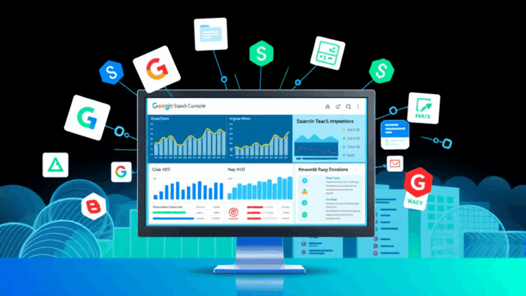
Too many people export Google Search Console data straight into client reports and trust it wholesale. But here’s the thing: GSC won’t show you what happened after the click. No bounce rate, no session duration, nothing downstream.
When I had a client call me saying “Why are people bouncing off our top blog?”, I realized: oh right. Entire report came from GSC. We were showing clicks and impressions only. When I paired Pageview duration data from GA4 and added scroll depth trackers via GTM, it was clear that users dropped off halfway through.
You can’t trust GSC to tell the conversion story. You need analytics overlay — preferably user behavior/session-level data — to make sense of it. Otherwise, you’re reporting noise.
- Use heatmaps (like Hotjar) to show engagement gaps
- Add Average Engagement Time from GA4 — not just “sessions”
- Break out scroll depth on long-form content
That way, when a post ranks well but fails, you can show exactly where it fails to convert trust.
Local vs National SERP Volatility Needs Different Narratives
The reporting problem I hit with multi-site clients was always the same: what wins locally doesn’t move the needle nationally, and vice versa. I had this HVAC franchise with six locations across three states — and nobody could agree whether we were ranking well because only some markets showed growth.
What finally helped was splitting out national keyword intent rankings vs. map pack vs. local organic into three separate tables and making each market its own color. Huge pain manually at first, but later automated it via a custom Looker Studio data blend merged with zip-linked rank tracking.
The real kicker was discovering that Google’s local results were partially geo-inferential based on user behavior, not just pure IP or declared location… especially in mobile-heavy categories. Basically, two people a mile apart were seeing different local 3-packs depending on click/call signals from recent searches. Undocumented, but noticeable when testing via VPN + real phone versus Chrome DevTools override.
Report Delivery Isn’t The Report — It’s the Story
This is going to sound almost philosophical, but here we go. I’ve canned half a dozen very competent SEO contractors mostly because they sent perfectly formatted reports with zero interpretation. You get 50 slides of data and no idea what was accomplished. Clients don’t want a numbers dump.
What worked best for me was treating SEO stories like campaigns — give each period a headline. Not “Q2 Results,” but: “Pillar Content Expanded, But Conversion Fell on Mobile”. That sounds dumb in a spreadsheet. But in a PDF or a Loom walkthrough, suddenly people pay attention.
Underline the why:
- We gained 300+ new terms via long-tail intent, linked to three old posts
- Mobile bounce rate grew after a layout change that hid the CTA behind a collapsed div
- This led to a conversion dip — same traffic, less action
One client I had actually said: “Wait, that explains it. I thought it was just seasonality.” Framing made the data digestible.
The Nightmare Clients Who Want 50 SERP Screenshots
Let’s just call this what it is: some clients want screenshots of search results because they don’t trust the tools. Fine. But don’t waste your whole day punching queries into Incognito and hoping nothing goes weird with local results injection.
Also — Google changes search appearance based on history, Google Business Profile activity, and click feedback. What I see in Incognito Chrome isn’t what my client sees logged into her personal Gmail in Tucson.
I once had to explain to a dentist client why she saw her site #1 and I saw it #4. After 20 minutes, turned out she had over 40 past clicks to her own site, and Google personalized those results aggressively. Documented? Nope. Predictable? Not even close. I’ve seen clients screen-share the homepage showing up for “dental anxiety tips” just because they visited it last week.
If you have no choice but to include visuals, use a consistent location emulator and search parameter string. Otherwise, don’t bother. You’re just feeding a moving target to people expecting print static.
