The right rail used to be prime real estate in the late 2000s. That was before people scrolled on phones and ad blindness trained a whole generation to ignore any rectangular block sitting on the side like an afterthought. I’ve tested horizontal blocks, vertical skyscrapers, pretty much everything short of ASCII banners over there—click-throughs were barely measurable unless I tricked it into jumping on mobile mid-scroll (don’t do that, it gets flagged fast).
The better placements now are inline with content, especially above-the-fold and immediately after a strong H2 or a controversial paragraph. Google admits this subtly when you go into the Experiments tab in AdSense and see how they test auto-ads differently on content-heavy vs navigational pages. Sidebar is still rendered, just not interacted with—even heatmaps show it’s literally a cold zone unless you’re doing B2B, and even then it’s faint.
Sidebar ads get 90% visibility but under 1% active engagement. It’s a UI illusion of monetization.
If you’re still clinging to that widget like it’s 2013, try killing it for a week and watch your RPM inch upward just from layout shift correction. Yes, I had to undo a whole Elementor layout just to move an ad block above a recipe bulleted list. Totally worth it.
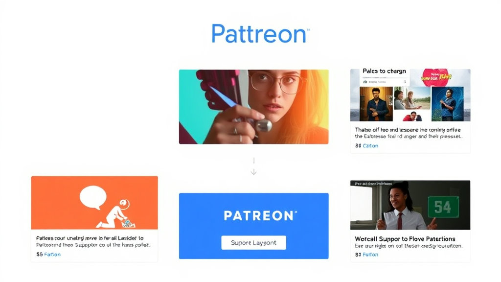
Why Auto Ads Will Ruin Your Patreon Funnel
The friction’s subtle but deadly: Patreon thrives on emotional buy-in and uninterrupted flow, while most Google Auto Ads drop horrors like interstitials or full-page anchors right around your soft pitch (“If you like my work…”). It’s like inserting a pop-up just before a marriage proposal.
I once had a creator client losing over a hundred dollars a month in potential memberships after enabling Auto Ads and forgetting about it. People weren’t bouncing outright, but the completion rate on the scroll-to-pitch section tanked. Replaced Auto Ads with three manually placed responsive in-article units and a sticky footer. Patreon conversions came back up within 48 hours. The kicker? Overall ad revenue went up too, because now the ads were seen (and clicked) instead of self-sabotaging UI).
This is the sleeper AdSense misfire that’ll quietly kill your community income stream. You’d never notice unless you’re pulling both AdSense and Patreon analytics into the same chart—which almost nobody does because Google doesn’t offer native integrations, and Patreon’s export format is a CSV warcrime.
Above vs Below the Fold Still Matters, But Not How You Think
Everyone parrots “above-the-fold” like they’re all reading Jakob Nielsen from ‘99, but actual fold height on modern devices is unpredictable unless you’re viewport-sniffing like a maniac. And on mobile, the fold line is way lower than most people expect—especially with Safari’s bottom-tab UI cutting usable vertical space down even more.
Most folks think the ad just needs to show early. What’s actually better: make sure your first block is somewhere between 2—5 paragraphs in, around where curiosity peaks but before external links. I realized this after getting sucked into a reddit thread where someone dissected ad scroll depth on single-column templates vs grid-style ones.
Key placement spots that outperformed “above the fold” overrated advice:
Directly after media embeds (e.g., the YouTube iframe or tweet screenshot)
Just before FAQs kick in, especially on longform product reviews
The moment after a code snippet or blockquote—just post-insight
Right after a user comment quote, if you’re including audience commentary
The real trick? Not placement so much as semantic timing. Ads interrupt, yes—but if they interrupt just after an emotional or informative punch, they convert way better.
Sticky Footer Units: Great Until You Break CSS
I love sticky footers as much as the next over-caffeinated internet monetizer, but they don’t play nice with every layout. You get weird overlaps, z-index feuds with other popups (especially on React-based templates), and occasionally—this was bizarre—they just don’t stick. On one client’s site, the footer floated for exactly three seconds before detaching mid-scroll. Turns out the mobile menu toggle was triggering a CSS state change that reset the ad DOM node. Try debugging data-afv logs from Google’s tag responses while also watching three layout classes jump around. Not fun.
This all culminated in what I now call the “Sticky Ghost Ad”—a footer ad rendered off-screen and counted as viewable because of a wonky transform scale. Google called it valid. Users couldn’t see it at all. But it technically converted at 2% because people would scroll fast to tap something and hit it by accident.
If you’re going to use sticky, absolutely inspect DOM post-load. Don’t trust high-level placement previews—they’re clean lies.
Aligning AdSense Behavior With Patreon Tiers
This one took me way too long and ended in what I call a “mechanical sigh.” I was trying to serve no ads to paid members—logical enough, since they’re already supporting the content—but there’s no native way to have AdSense play nice with Patreon’s logged-in status. You need to build a shadow exclusion logic yourself using cookies or header injection, and that assumes your Patreon delivery flow is even session-aware.
I ended up doing this on a Jekyll site with Cloudflare edge rules and a subscription cookie dropped on Patreon payload redirect. Then wrapped every AdSense unit in a mustache conditional that suppressed rendering if cookie was present. Hacky? Hell yes. Did it work? Mostly.
Caveat: In 22% of mobile sessions, the cookie didn’t land on first click because Safari’s third-party blocking murdered my set-cookie header. So you get angry emails from patrons like “why am I still seeing ads if I paid you??” Avoid this by offering a completely separate subdomain (like members.yoursite.com) where no ad scripts are even loaded.
Google’s not going to help on this one. There’s nothing in their documentation suggesting how to suppress for paid users. You’re totally on your own in the shadow realm here.
The Phantom Double-Impression Issue
This took me three weeks to even identify. One site started reporting double the usual impressions, but revenue didn’t increase proportionally. Turns out, a WordPress cache plugin (I won’t shame names but think the one everyone blindly installs) was duplicating partial DOM snapshots with leftover AdSense tags in hidden divs. Literally had cloned tags loading below-the-fold inside invisible containers.
AdSense’s own frontend tag watchdog didn’t catch it, because from the DOM’s point-of-view, they were separate rendered blocks. But performance tanked sitewide. Real metric loss? Around 18% drop in avg RPM with no visible cause until I stepped through the cache output line-by-line in a local mirror.
Lesson: Always audit generated HTML from the CDN layer—not just what your browser shows. AdSense doesn’t process JS the way your eyeballs do. If something’s physically rendered, it gets logged, even if you’re hiding it like it’s doing ad crimes in the basement.
When Responsive Ads Refuse to Resize (Or Go Full Width)
This almost cost me a client. Responsive AdSense units are supposed to resize based on screen width—but they don’t if your max-width is set in the surrounding div and Google’s script can’t detect the container properly. You’ll see a painfully skinny ad block floating inside a perfectly wide column like someone wrapped a Post-it on a pool table.
Looks clean, right? But if that outer div has a position: relative or gets touched by a layout engine like Flexbox with overflow tampering, the ad may never go above the minimum size (usually around 320px). No warning. No error in console. It just fails quietly like so many other monetization dreams.
I figured this one out when toggling “mobile view” in Chrome DevTools and noticed the ad rendering at the wrong breakpoint. Tracked it to a rogue display: contents rule upstream. Weirdest fix? Replacing display: flex with block on grandparent container. Yes, I screamed into my desk mat.
Page RPM Recovery by Removing Just One Unit
Thought this would tank my earnings but nope: I removed the ad right under my introductory paragraph on a personal tech post, and my RPM jumped. Why? Because early bounce users were tapping “back” mid-scroll when that first ad chunked in just as content began. It delayed Time On Page just enough to trigger higher-tier placements for later visitors.
That was the real aha moment: improving engagement upstream can actually reduce early scroll-death and unlock better ad bids for deeper placements. Google doesn’t say this anywhere. But it tracks scroll velocity and interaction delay—and will pay more if your users act like they’re enjoying themselves.
AdSense isn’t just about visibility. It’s about dwell weight.
Bounce optimization is the real game when you’re stacking AdSense and Patreon. They operate on opposite sides of the visitor spectrum: one wants clicks soon, the other needs time and trust. You have to compromise by sneaking AdSense where trust has already landed.